 Image by kkilometer
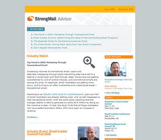
Designing HTML emails is not really that difficult. I’ve done it several times myself but it can sometimes feel like an impossible task if you want to make the email appear exactly the same on different email readers. If you think cross browser site design is challenging, wait till you try creating for emails.
Why is it so difficult?
For starters, email readers are not as sophisticated as browsers. Yes, even though some are web based like Yahoo and Gmail, they still modify your code to suit their interface. You cannot get fancy with CSS and there are a few things you should do for consistency like use good old fashioned tables for the layout and using HTML breaks and not paragraphs to create the illusion of paragraphs.
The other reason, like browsers, each email client reads HTML differently and there are a lot more ways to read email than there are browsers. Windows Mail, Outlook, Mail (for Mac), Yahoo, Gmail, Hotmail oh and don’t forget the numerous mobile devices from iPads to all sorts of smartphone brands.
Third – your newsletter service provider. Lately, I’ve been working with 1ShoppingCart on this for a client and the bottom line, their HTML email newsletter editor suck. It’s so bad, it makes me want to put a fist through the computer. The reasons are plenty but the bottom line is, they do not seem to understand email HTML is quite an animal of its own but the tools provided are created for web-based HTML. That’s not good.
Also, because of the delicacy of the HTML code, one small delete in the HTML editor can mean big difference in the email. There is no way from keeping the client out of those areas except to educate them about basic HTML – not always pleasant.
What can make it easier?
Start with an HTML email blueprint. If you are buying templates, make sure the designer understands how tricky HTML email can be to get right across the board and have coded tweaks for popular email readers and mobile readers.
Reconsider your provider. Aweber has recently released a beta of the new HTML email designer where you can create a ‘master’ layout where you can fix elements that appear on every email and identify which elements can be edited when writing the email. This is great when working for clients or even yourself because then, you keep the rest of the design consistent and won’t mess it up with a fat finger.
I don’t normally send elaborately designed HTML emails, my HTML emails are text based (to make them look like text emails) but so far, I’ve not had as much grief with Aweber.