Have you noticed how some people’s blog posts just seem to be more visually appealing than others?
I know I do and that’s why I always try to add visual elements to emphasize my points, highlight key areas or just make it overall more readable and scan-able.
There are several ways to do this.
- Shorter paragraphs, more white space and easier writing is a great start.
- Next, bullet points can be jazzed up a little with nice graphical bullets. If you use WordPress, most themes already have a bullet design coded in to work nicely with the rest of the theme and for the most part, common blog posts this will work. Sometimes, you may want to differentiate two lists on the same posts. That’s when two different graphical bullets can help clarify the differences visually.
- Another thing you can do is to add boxes. The most common boxes we see are testimonials but you can always use boxes or the illusion of boxes to highlight a quote or to feature clips of your content.
- Similar to boxes, shading or highlight parts of your content with color like alerts or notices commonly seen on may sites can help feature some really important information. Especially the yellow notices because people are so conditioned to pay attention to them.
Be careful using these notices though especially the yellow ones because it might cause people to dismiss legitimate system notices you really want them to see when it matters. Typcially, blue is for information, yellow or red for alerts, green is for confirmation. Of course, there are no hard and fast rules about it. But you should be aware that’s how people are trained to look at shading.
Knowing this, you might be eager to implement but will quickly find out, it’s not as easy to add these styles as it should be. Why?
Because it takes a little HTML and some of CSS knowledge to get it. Even for a geek like me, it is tiring to upload bullet images, pop open the text editor, find the code, tweak and re-upload every single time we want to make our blog posts or sales pages look pretty.
The nice thing about WordPress is, you can find quite a number of plugins that help you add these cool design elements but I’ve personally never liked them because of one huge reason.
They use shortcodes
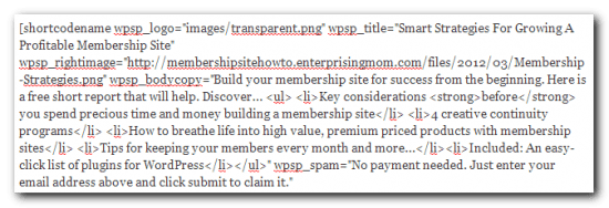
So why is that so bad? For one. When you disable the plugin, your content becomes an unreadable blob of code, or at the very least, looks awful with shortcodes around it.

I prefer to have something that won’t destroy my content when the plugin is disabled, something that keeps the HTML intact. And, something that is easily editable inside the WYSIWYG editor. Better yet, if I can see what is going on. It was tough to find something like that with the specs that I wanted and so I built it. Watch how my Super Styles plugin works.
Nice? Want to know something better? You can get it with PLR rights for a limited time.
Coupon code: SUPER10