To build our list, most of us know we need to put an opt-in box on the very top of the sidebar, or above the fold. But have you ever wondered if that enough?

To find out, let’s see what some top websites and blogs are doing to get that opt-in.
LeadPages
Since they are all about getting leads, let’s start there. There is a lot of content on the LeadPages website. Clicking on Podcasts, you will find the expected things. The podcast synopsis, listen and download buttons. There’s an invitation to subscribe at the top as you’d expect.
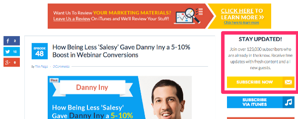
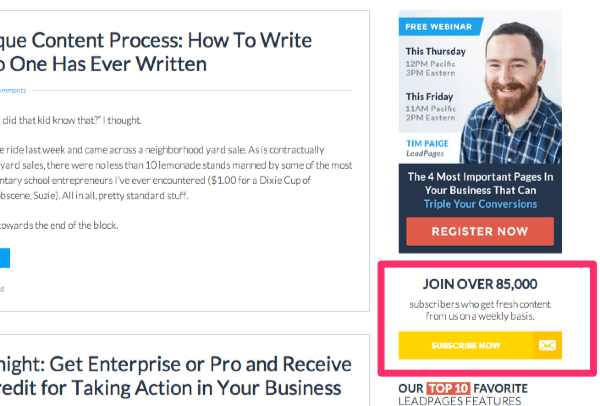
This is also repeated on the blog except it’s the second item, below a webinar promo. This is a little interesting because usually, we are discouraged to offer two opt-ins.
When you click to download the episode, you are asked to sign up. This is uses their LeadLinks (TM) feature. In fact, the whole post on each episode heavily utilizes LeadLinks(TM).
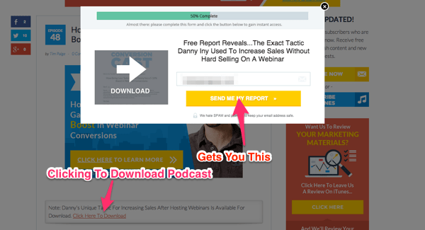
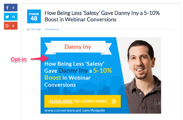
The feature image is a call to action that leads to an opt-in when clicked.
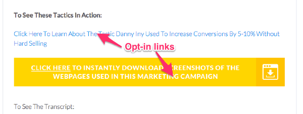
Handouts and downloadable reports are great. This is also an opportunity to build that list.
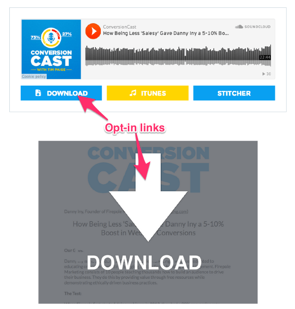
Ask them to opt-in again when they are listening. The blue download link is an opt-in form and for good measure, a huge download image below the player so people won’t miss it.
HubSpot
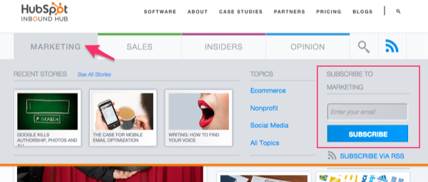
Another service all about inbound marketing, and helping you get leads. What’s interesting on their main blog page, the opt-in box is in a hidden header. You will only see that whole grey section when you hover over the topic tab. Each topic features different content and opt-in boxes. Not sure how well it works hidden up there but it would be interesting to see if that remains over time.
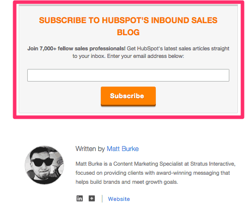
There’s also an opt-in at between the end of the blog post and the author.
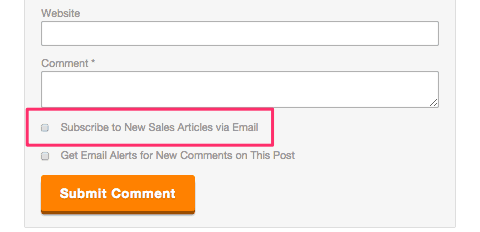
In the comment form, an offer to subscribe to articles in this category when people submit their comments. Unchecked – very important so people don’t get tricked into opting in.
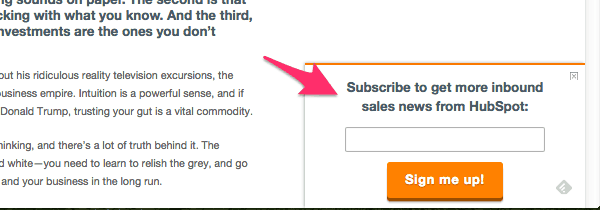
About a third of the way scrolling down, there’s also a popup that appears at the bottom right hand corner, inviting people to opt-in once again for updates from that category.
Social Media Examiner
On Social Media Examiner’s (SME) home page, their opt-in is the hero of the page, featured prominently above the fold. It also fits beautifully with the overall design. This only appears on the home page.

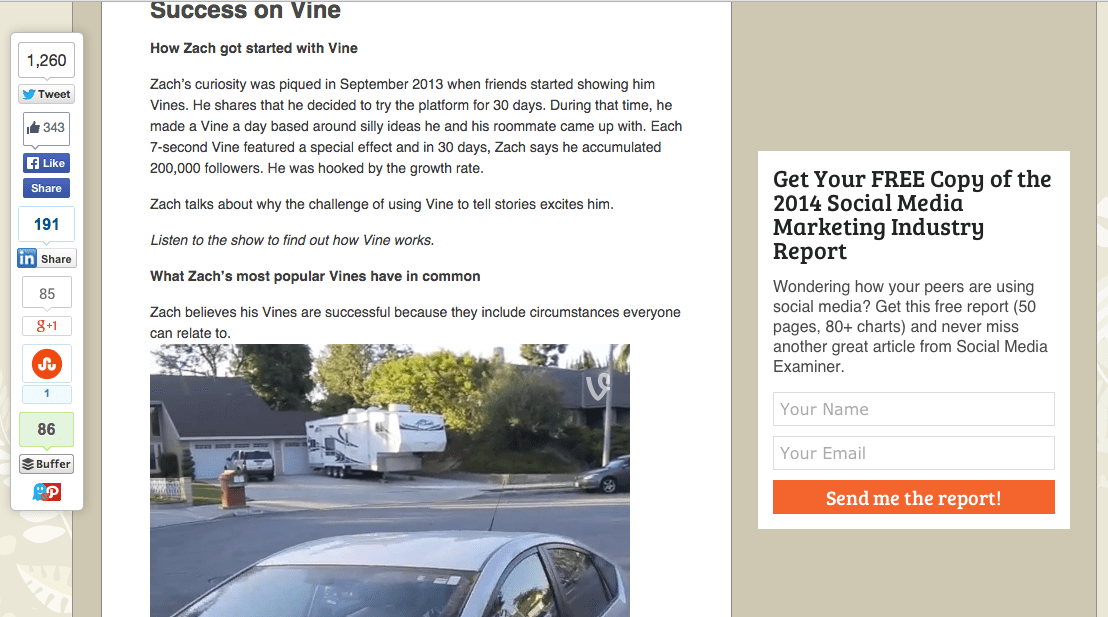
In the sidebar of the blog, you’ll find their newsletter and free report offer.
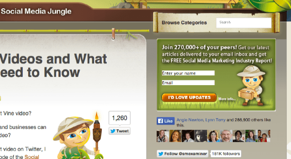
This is repeated again with a different opt-in box design and copy about a quarter way down the page.
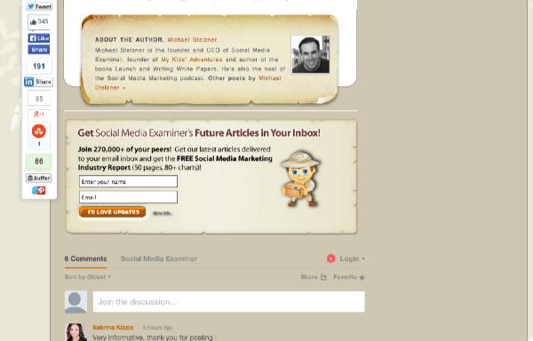
Then finally, between the end of the post/author bio and the comment section.
CopyBlogger
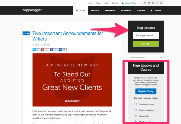
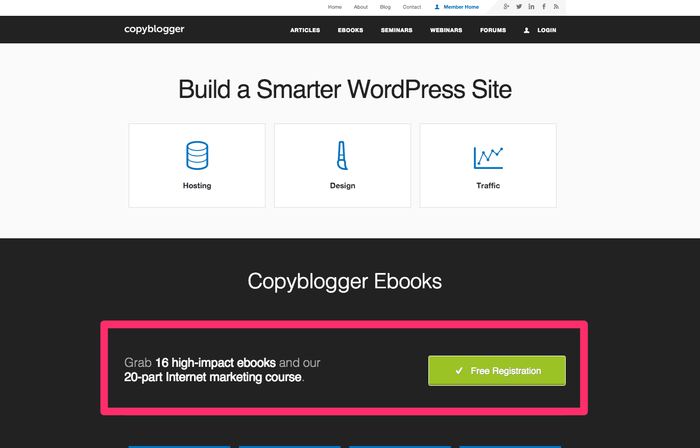
Copyblogger seems to focus on funneling leads straight into their system. On the home page, there’s a call to action to register for an account to gain immediate access to free books.
On the blog, the blog updates are featured over the registration. Again, like LeadPages, I find the two call to opt-in/register interesting. However, since the copy is clearly worded, one is for blog updates and the other is a registration to receive free books, I suppose that works out. Either way, these build their leads list.
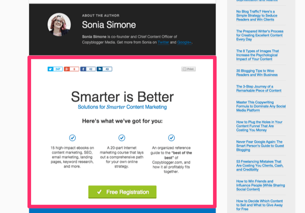
Immediately after the post, between the author bio and post footer is a huge call to action again to register. This is a really large box that people won’t miss.
QuickSprout
On QuickSprout’s blog sidebar, you’ll find the ubiquitous opt-in box on the very top.
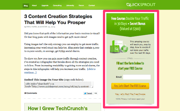
At the bottom of the post, there’s another offer to opt-in. They do not, however, appear to be for the same free product.

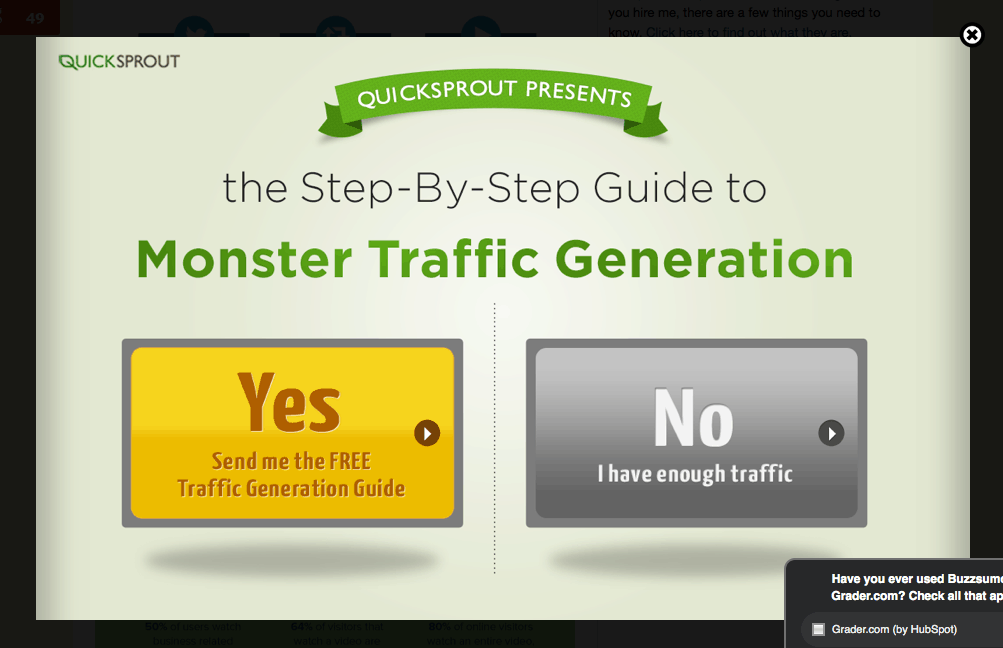
On your first visit to the blog, there’s a gigantic popup that shows as you scroll down about a third of the way. This box is very large, taking up almost the entire screen. The copy “No, I have enough traffic” is also interesting to note.
While I didn’t notice more opt-in opportunities, I did see a lot of call to actions to buy his courses or try their services. Definitely a great study for another time.
Conclusion
I must say this exercise was rather time consuming since I stopped every so often to document what I see as well as take screen shots. If you’re doing an analysis like this for yourself and taking/annotating screenshots, it wouldn’t take quite as long. Either way, you’ll learn some interesting things. In this exercise, we learned:
- Above the fold sidebar. The space on the very top of the sidebar is still prime real estate for opt-ins.
- Ask multiple times. This is perhaps the biggest takeaway. All the sites we studied had opt-in boxes and or the call to opt-in in multiple places.
- Ask in different ways. Though the offer may be the same, varying your opt-in box copy on the page slows people down so check out the offer again.
- More than one type. Do not be afraid to try two different types of registrations such as we saw at Copyblogger and LeadPages. They promote different things but they all put people into your funnel, albeit down a different path.
- Ask for the opt-in at different stages of the page. The common scenario appears to be on the very top, at the end of posts, or part-way down in the sidebar, in a scroll activated popup, and an exit popup. Only LeadPages used opt-in links inside the post, which is a really neat feature and definitely worth trying.
- There isn’t anything magical about the process. Here’s what I mean. Most of what’s applied on these sites are fundamentals we’ve learned for a long time. Once in a while, you’ll find some great technology but really, it’s not exactly revolutionary – just using simple tech to present your opt-in offer. It brings to mind something I learned from a top marketer years ago. That is – do not despise the simple things. Don’t think we have to use the latest whizz bang tech. Often times, it’s the simplest, most basic things that get things done. Everything else is cherry on top (or a distraction depending what it is).
The Tools
Though some of the sites we studied use some pretty expensive technology, don’t lose heart. If you use WordPress, many of these can be replicated with a plugin one way or another.
Obviously, you’d need a email mailing list system. We use Aweber.
- For linked opt-ins, take a look at OptinLinks.
- Jazzy Optins is a plugin to make your sidebar opt-in form look great.
- PopOnScroll will give that little popup after you scroll. You’ll see it right on this blog. It should have popped up on the right bottom corner a few moments ago.
- Last Chance Exit Popup does that it says on the tin, pops up an opt-in box when it detects a user is leaving your page.
- To add an opt-in to the end of your posts, you shouldn’t need a plugin. All it takes is to add the opt-in code to your theme which either you can do or your developer can handler. Some themes also have this built in.
- Finally, to let people opt-in to your list when they leave a comment, as seen on HubSpot, the Comment & Subscribe plugin should work nicely.
Now, it’s time to give these techniques a whirl to see how they work for you. Remember, as you’ve seen on these sites, don’t just stop at one method. Looks like I’m going to get busy myself.
