Why Aweber’s Editor Rocks (After Much Tantrum and Feet Stomping)

Child throwing a tantrum

Image by Jentsoi

It’s true. In general, humans simply don’t do well with change.

Though I’m OK with change, somehow, when Aweber rolled out their new editor sometime ago, it just stuck in my craw.

Maybe it’s because I’ve been with Aweber almost 10 years.

Maybe because I take so long with Email already I just want to get in, out and be done.

Who knows?

Having said all that, there’s one thing about me that has served me very well.

I won’t let tech kick my butt. I’ll dig in and wrestle till I can pin it down good.

Good thing always come out of that – usually, but that’s another story for another day. This time, my effort and time spent understanding Aweber’s editor pays off every week. This is why.

A Better Editor for Email

Sometime last year, I was hired to create an HTML email. I’ve never been too keen on doing them because it is easy clients who aren’t familiar with HTML to mess it up.

It doesn’t help when most email systems don’t come with a good HTML editor customized for emails.

I did it anyway – something about challenges that’ll be the death of me one day.

Sure enough, not a week into using the carefully crafted template, the client come back and kept coming back because it didn’t look right. Not like the issue I had done for them. I anticipated this.

You see, when it comes to HTML for emails, it’s like a throw back to the early 90’s. Despite all our new fangled technology today, email readers don’t do external stylesheets or CSS well.

Image by Typexnick

Image by Typexnick

Many also don’t like paragraph tags so you have to use two line breaks to make it look like paragraphs. Horrors!

This normally wouldn’t be an issue, but remember when I said most email services have bad HTML editors?

That’s because when you press enter in the editor, it creates a paragraph – not line break. It doesn’t matter how well a job I do a creating a newsletter template, clients will always mess it up because the HTML editor doesn’t understand paragraphs don’t play nice in emails.

It’s funny how many email services don’t even try to fix something as basic as that. And, for a long time, Aweber‘s old editor did that.

That’s why I never sent HTML emails. Until now. The new editor does a much better job with this.

Fixed Templates

Anything ‘fixed’ doesn’t sound very good but it is! If there’s one lesson I learned over this year it is making unbreakable templates. It’s easier on me, and makes a ton of sense when outsourcing.

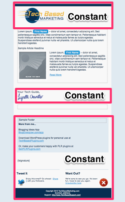
This is what I mean by fixed, unbreakable templates. Take a look at my email newsletter design below.

TBM_Email_Template

See those areas I marked as constant? With Aweber’s new editor, I can do that. So, when I ask a VA to send a newsletter or add an autoresponder using this template, I know they won’t accidentally delete my logo, the signature or mess up the HTML so the whole template looks all crazy.

The results are consistent whether I did it, a VA did it or a new intern without HTML knowledge did it.

Fixed templates make email creation fast too since all I have to concern myself with is the content. Not the design or taking care not to break the design.

If you’d like to learn more about HTML email creation, here are two things to do.

1. Learn or brush up your basic HTML skills.

2. Stay tuned to my newsletter for an announcement to help you with this. If you’re not signed up yet, join us.
 

Do You Want A Hands-Free Business?

Then get this guide to help you systemize your business so you'll have more time working on your business.

!
!

Hey! I want to make sure you know what you're getting here. In addition to the guide, you will also receive our memo that includes special offers, announcements and of course actionable information.

Terms and Conditions checkbox is required.
Something went wrong. Please check your entries and try again.
Facebook Comments

6 Comments

  1. dataplextech on October 11, 2013 at 4:29 pm

    I like receiving HTML versus the typical boring text emails everyone sends out.  This is why I actually read your emails.  However, how well does HMTL email work for people that get email delivered to a mobile device? 

    Bruce,


  2. Bill Nickerson on October 11, 2013 at 6:15 pm

    My problem with AWeber’s new editor is that I can’t save consistently. It will save the email fine as a draft or autosave, but when I go to schedule it or update the autoresponder timing it just hangs. Sometimes it actually comes back with an error that says that there might be an issue with my antivirus software.

    I’ve checked with tech support. They first told me to try switching browsers. It didn’t help. So I’m stuck using the old editor for now (I hope they keep it around). I suspect that since I’ve switched to satellite internet the lag times are causing the problem. But no other web based editors that I use have these problems. So I don’t understand what they’re doing differently. And they don’t seem that interested in trying to sort it out.
    But I do like the new editor for the most part. Wish it worked better for me. I didn’t know about the constant parts. That is a great feature.


  3. LChandler on October 11, 2013 at 8:48 pm

    dataplextech Hey Bruce! Thanks for stopping by.
    I think in general people like receiving nice looking emails. I too love them especially some of these really beautiful ones. Sadly, there’s still a lot of stigma with HTML emails among long time Internet Marketers but that’s also changing.
    As for mobile, there is no deliverability difference between mobile and desktop that I know of. However. There is huge difference in view-ability.
    Like designing a web site, it pays to common sense things. Like don’t make your design too wide. Sadly, this isn’t much heeded. I just took a peek at emails sent to me by Hotwire and it’s way too wide for a phone forcing me to scroll sideways. Not good.
    I tried to be mindful of that in my own template. It’s better in the sense I could read the text without scrolling side to side but I know the actual with of the template is still wider than the screen. Guess I’ll have to work on it some more and that’s the thing. Got to be willing to keep tweaking.
    Besides that, I’d try to keep my images as light as possible. While most email readers (including mobile ones) block images by default, I think it’s only considerate because as a user, I find myself tapping that View Images button almost all the time.
    A great resource on email design is Email On Acid. It’s a service you can test your design on many different platforms including mobile devices. 
    http://www.emailonacid.com/
    If you go to their blog, you will also find responsive email templates you can download and work from.


  4. LChandler on October 11, 2013 at 9:03 pm

    @Bill Nickerson Thanks for chiming in! That sounds so frustrating.
    I had a lot of trouble with it and sometimes it is still quirky. Entering links is something that is hit and miss although I’ve noticed it’s getting better.
    These are all the reasons why I despised it for so long.
    Once I started building my own template, using it and nailing down those constant portions, I think it made a big difference. Not because the problems went away but because I’m spending less time interacting with the editor.
    Here’s what I normally do. The email itself is written in Evernote (or a text editor. I just use Evernote in case I have to get up and go in a hurry).
    Once I nail down my subject line and message, I’ll log into Aweber, copy the last email and swap out two things.
    1. Subject – no problems
    2. The actual content of the email
    Next, I have to  make those links work and then I’ll test it and schedule.
    Re-reading your comment perhaps this point is where the difference is.
    I never send an email immediately (for broadcasts). All emails are always scheduled even if it is only 15 minutes ahead.
    I do this because of all the bone headed mistakes in the past 🙂 this way, I always have a 15 minute buffer for all those “Oh I forgot that link” moments.
    I’ve always used Chrome with the editor on both Windows and Mac though.


  5. dataplextech on October 12, 2013 at 1:54 am

    LChandler
    Thanks for the feedback and link.  I agree with your philosophy.  I’d much rather read nice looking, well formatted emails.  This is why your emails always get my attention.
    Bruce,


  6. LChandler on October 15, 2013 at 10:07 am

    dataplextech Thank you Bruce. This certainly makes me want to continue and do more good things with it 🙂