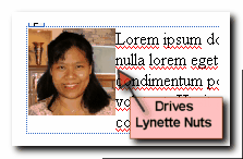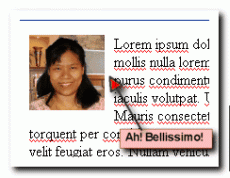
Alice Seba recently posted on Twitter that one of her pet peeves is images without white space around it. Honestly, that drives me nuts too. I cannot stand text being squished up to the side of an image. Yeah, it’s picky but at the same time, it’s about making your site look good. I know you want it to.

Well, I for one prefer to have as little HTML in each page as possible. Therefore, I use CSS to help me. It’s not quite automatic but pretty darn close.
Here’s how you’d do it with just a little bit of CSS code.
Before you proceed, it is wise to make sure there is no code that already does this in your stylesheet. Otherwise, the browser will automatically choose one, ignore the other and you’ll be wondering why it didn’t work. First, enter this into your CSS
img.right {
  float: right;
  margin: 10px 0px 10px 10px;
  }
  img.left {
    float: left;
    margin: 10px 10px 10px 0px;
  }
Next, whenever you are entering a picture, just decide if you want it right or left aligned. For left aligned images, use this. Note the class=”left”.

Lorem ipsum dolor sit amet, consectetuer adipiscing elit.
Vivamus eu augue. Aenean diam lectus, lacinia quis, varius nec,
sollicitudin eget, urna. Proin nec nisi.
That will look like this:

Lorem ipsum dolor sit amet, consectetuer adipiscing elit.
Vivamus eu augue. Aenean diam lectus, lacinia quis,
varius nec, sollicitudin eget, urna. Proin nec nisi.
For right aligned images, use this. Note the class=”left”:

Lorem ipsum dolor sit amet, consectetuer adipiscing elit.
Vivamus eu augue. Aenean diam lectus, lacinia quis,
varius nec, sollicitudin eget, urna. Proin nec nisi.
That will look like this:

Lorem ipsum dolor sit amet, consectetuer adipiscing elit. Vivamus eu augue. Aenean diam lectus, lacinia quis, varius nec, sollicitudin eget, urna. Proin nec nisi.
There’s actually another method to truly automate image spacing, without using “class” but that could mess up your other images. Besides, by using a different class for left and right, you can quickly have a mix of left or right aligned quickly and easily. Also, you can use the class to align something else like maybe a text blurb.