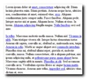
 Many of us have been told that you should leave links on your web site blue. Don’t go changing link colors around and for goodness sake, leave the underline alone too. You’ll confuse your visitors and people won’t click your links.
I absolutely agree. Links should be blue and underlined. That was until I began a makeover of our forum over at Mommasterminds recently. Before I proceed further, allow me to frame this post a bit. It is about design and usability. Not SEO that’s just not my game. In fact, I hesitate to use the term usability too but I’m getting ahead of myself.
Back to the forum make over. One of the first things I did was change the links of the default design to blue and underlined. But once I did that, every single link turned blue underlined. Not all designs are like that, some are better thought out and you won’t have this problem.
The trouble is, the more I looked at the pages, the more cluttered and confusing they became. All the links were fighting each other for my attention. So many links to click, so many places to go that I get lost on the site or worse, get lost on other sites, moving further and further away from the starting point.
In most designs, the original blue hyperlinks are very distinct. They stand out and begs the user to click on them. That’s a good thing. So, I took a good hard look at the pages and asked myself some questions.
- Which of these links are the ones I really want people to focus on?
- Which links are expected to be there but I don’t want it to stand out?
- Which links do I want people to click on most?
The general answer was – the links in the post should be the focus. I didn’t want people to be distracted with other links like profile, email, private message and signature links. I didn’t want to remove them, only tone them down so that people reading a thread can concentrate on the message. Links inside the post should be the regular blue underline since it is part of the message or discussion thread.
With this in mind, I set out to change the non-essential links to colors that work with the design colors. The essential links are left blue and underlined. The result is a much cleaner page, less distractions and blue links where I want people to click.
This make over has left me with a new impression. Blue links are good, but blue links specifically on those you want people to click on (think affiliate links, product links, featured content, recommended sites) are even better.